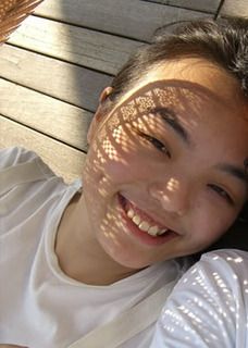
"Image produced by Sok Kuan"
Here are the entries i received for this challenge...
 Description:
I was inspired by the title and how it is positioned on the layout.
Feli says:
Wow! i totally love the blues!! and what a cool effect the glimmer mist created on the background...
"{LEAF}" by June
 Description:
I used the position of the elements as a reference for my LO. I used the left overs from my son's hangman set. There were little rectangles of letters that you pop out from the paper to use and all these grids were left.
Feli says:
I love the masking with glimmer mist and how the photos just stand out with the matting! I love the flow to the page.. And I can see how the page was inspired by the image! :)
Feli says:
I'm loving the red red page! and cool textures created with all the text on the PPs.. :)
We shall wait for these 3 ladies who had submitted to vote and release the winners tmr! so stay tuned!
Here's another layout i received a little too late... But i hope everyone will still admire this layout! Lady Grace, hope to see your take for the next challenge!
"crazy little thing" by Lady Grace

Description:
I was inspired by the negative space and the loops.
Journaling: We love to see you smiling and playing even though you look crazy sometimes. As long as you're having fun and enjoying yourself, we are happy. Your crazy smile is heart-warming. We are totally CRAZY for you
Feli says:
I love her interpretation of the image and the great use of white space. Love the loops around the photo, it just makes the photo pop! :)


No comments:
Post a Comment