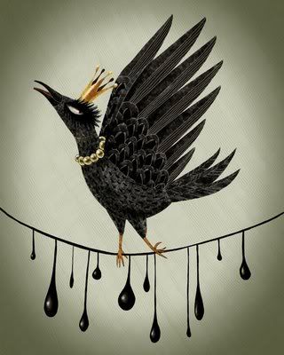
For Graphic Inspired Challenge 4, the challenge was to use this image by Sokkuan to inspire you to create a layout...

Description:
I was inspired by the bird (main photo) and the string under it (which I clustered by embellishments and paper along the horizontal line).
Feli says:
Description:
Feli says:
Love the masking of the crown on the background!
Description:
I was inspired by the dropping tears and the details on the bird feathers made me think of flourishes. Done using Scarlet Lime's Oct 2008 kit. The flourishes are all cutouts from BG Ambrosia Mandarin paper.
Feli says:
I love how she added the flourishes cut-outs! they look awesome! and i totally can see what inspired her from the graphic. :)
Description:
Am inspired by the black color.. first time using black as the background (usually very minimal black in my layouts) but I love how it turned out.. Also have sparkling black brads that hopefully mimic the dangling beads below the bird.. great inspiration felicia!
Feli says:
I love the black! It totally brings out the different elements on her page.


No comments:
Post a Comment