Wednesday, March 31, 2010

The winner for the Graphic Inspired Challenge 5 is...

Edleen!! Congrats Edleen! =)
Here's the winning project!


Hope you'll enjoy the RAK by our sponser, Ming!! Do email me your address so I can send the RAK out to you...

Stay tuned for the next challenge! =)

Monday, March 15, 2010

Entries for Graphic Inspired Challenge 5

For Graphic Inspired Challenge 5, the challenge was to use this image by Sokkuan to inspire you to create a layout...

"Image produced by Sok Kuan"


Here are the entries i received for this challenge...

"our dance" by Irit

Description:
I was inspired by the colors mostly and I was thinking about my dancing shoes!! we- me and my DH are addicted flak and ball dancers and the only shoes I buy are dancing shoes- so this photo inspiration was screaming "dance" for me.

Feli says:
I love how she got inspiration from the image of the shoe! Love how the flowers flow on the page...

"pure joy" by Edleen


Description:
The foot inspired me to use this photo of my feet while on holiday =D. Stamped border, used dried paint and stamped on it.

Feli says:
Love her stamped border and that photo of hers is awesome! Nice texture created by the paint..

Thursday, March 4, 2010

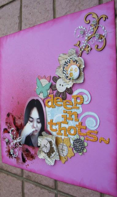
deep in thots~
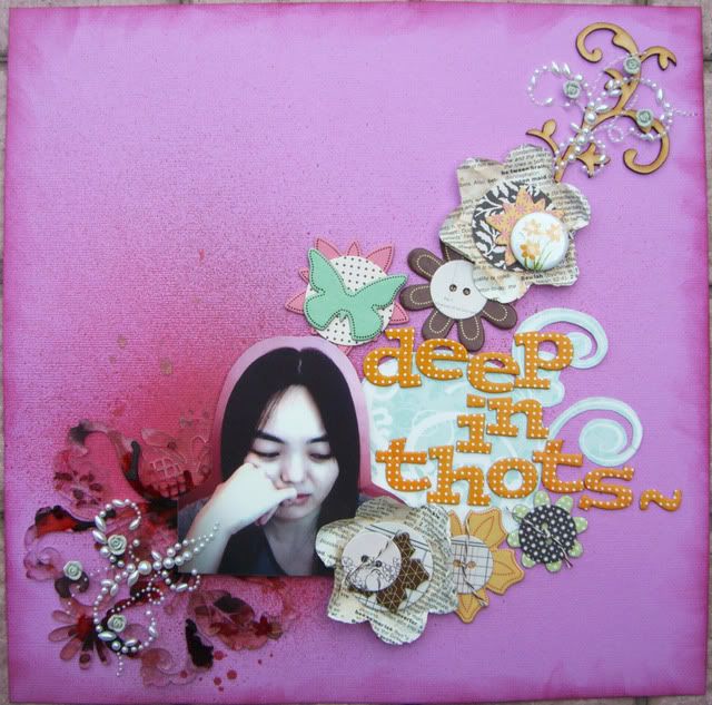
Here's what I did for Graphic Inspired Challenge 5... I was inspired by the splatter of paint on the image and the composition in the image. So I created one on my page using mists and through the flow of the embellishments...

Added some blings and a flower made using book paper and chipboards by American Crafts and Jenni Bowlin...
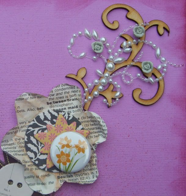
Added some alcohol ink onto the clear acrylic by Harmonie...
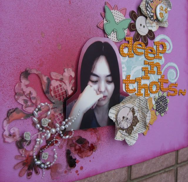
Also added a cut-out from the packaging of the acrylic by Harmonie to matt the title...
Monday, March 1, 2010

Graphic Inspired Challenge 5

Here's the Graphic Inspired challenge 5. Here's the image to inspire you... The challenge is to use this image to inspire you to create a layout... Click on the image to get a larger view of it... To find out more about how the Graphic Inspired challenge works, check it out here ...


"Image produced by Sok Kuan"


Here's a description of the image from Sok Kuan
"This is a commisioned job from a fashion magazine. The art director wanted to feature the wedges. I personally admire David Downton's work very much (www.daviddownton.com), so I made use of this chance to learn and practise the David Downton's style. I like the combination of black mud splash with white clean cryltal glass-like wedges that creates a dramatic contrast. Everything else kept simple but more details are seen on the wedges."

Email me at feliscraps_challenge [at] hotmail.com with a maximum of 3 photos of your layout with a description of it by 30th March, 12 noon.

I hope this challenges you to come up with something creative! So let your creative juices flow, DO IT DIFFERENT and just have fun! :) I can't wait to see what you come up with...

Do check back the next few days to see my take on the challenge! Will leave you to think about the challenge!