Friday, December 4, 2009
Merry Christmas Album
I did mainly tearing on the pages. Tore the edges of the PPs and the cut-outs from PPs. I love how it turned out!
Tuesday, December 1, 2009
Technique Inspired Challenge 4 -

To find out more about how the Technique Inspired challenge works, check it out here ...
Email me at happyscraps[at]ifyouarehappyandyouknow.com with a maximum of 3 photos of your layout / project with a description of it by 30th December, 12 noon. Voting starts right after all the layouts / projects are posted on the blog!
I hope this challenges you to come up with something creative! So let your creative juices flow, DO IT DIFFERENT and just have fun! :) I can't wait to see what you come up with...
Do check back the next few days to see my take on the challenge! Will leave you to think about the challenge!
Monday, November 30, 2009
The winner for the Graphic Inspired Challenge 4 is...
Friday, November 27, 2009
Entries for Graphic Inspired Challenge 4

Description:
I was inspired by the bird (main photo) and the string under it (which I clustered by embellishments and paper along the horizontal line).
Feli says:
Description:
Feli says:
Love the masking of the crown on the background!
I was inspired by the dropping tears and the details on the bird feathers made me think of flourishes. Done using Scarlet Lime's Oct 2008 kit. The flourishes are all cutouts from BG Ambrosia Mandarin paper.
Feli says:
I love how she added the flourishes cut-outs! they look awesome! and i totally can see what inspired her from the graphic. :)
Wednesday, November 4, 2009
Gong Xi!
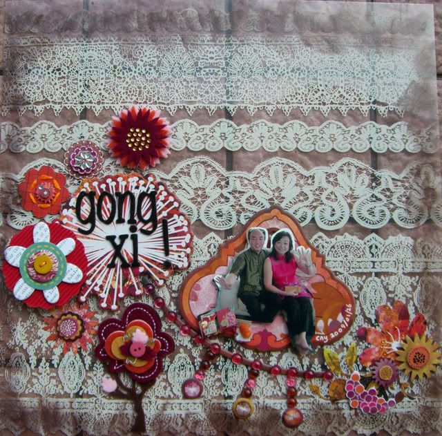
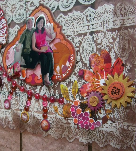
I did my page on a Hambly overlay. The draping was recreated using chipboard and dewdrops.
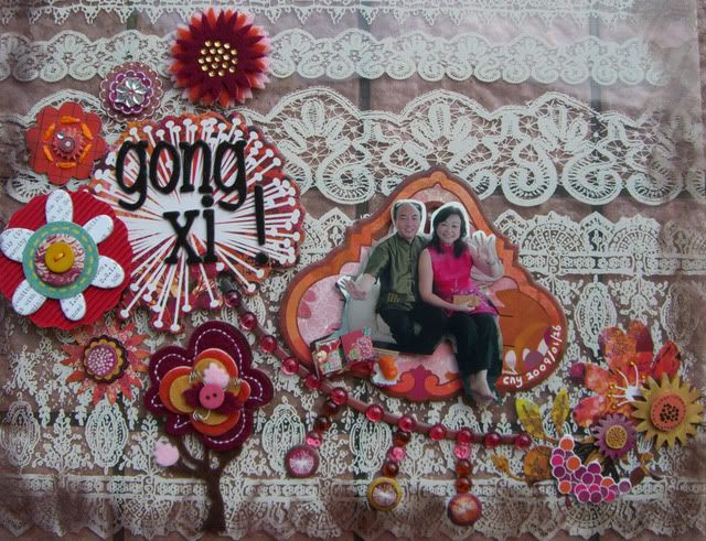
I also inked the edges of the overlay to create the effect in the graphic.
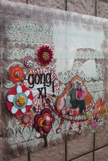
The rest was all about embellishing the layout! =)
Sunday, November 1, 2009
Graphic Inspired Challenge 4

"Image produced by Sok Kuan"
Here's a description of the image from Sok Kuan Email me at feliscraps_challenge [at] hotmail.com with a maximum of 3 photos of your layout with a description of it by 28th November, 12 noon. Voting starts right after all the layouts are posted on the blog!
I hope this challenges you to come up with something creative! So let your creative juices flow, DO IT DIFFERENT and just have fun! :) I can't wait to see what you come up with...
Do check back the next few days to see my take on the challenge! Will leave you to think about the challenge!
The winner for the Stash Inspired Challenge 4: All about Boys! is...
Saturday, October 31, 2009
Giveaway Winner!
I used random.org to generate the winner based on those who submitted their comments..
1) Mazlina
2) Tinkerbell (Michelle)
3) yyam (Yvonne)
4) bHappi
5) stamprgrl (Dalis)
6) Suzarte (Susan)
7) ming
8) Alin
9) Georgina
The winner is Dalis!! Do email me at feliscraps_challenge[at]hotmail.com with your address so I can send out the RAK to you. =)


Sunday, October 25, 2009
Entries for Stash Inspired Challenge 4 - All About Boys!

Here are the entries we received...

Description:
This layout is of my Little Boy Anis. I think the monster paper truly describes how mischievous he can be. Often when we tell him he's naughty, he'd say, I Anis I Good Boy! Oh well, that last for about a good minute or two. Plus the colours from this range of papers are fun and happy and joyful :)
Feli says:
Wow! I love the words stash she used and especially the photo! So cute to use what Anis said as the title.
Description:
Feli says:
I love the PPs and embellies she used! They go so well together especially with the use of the star buttons. They go very well with the doodles on the PPs! And I like how she printed the photo twice.
Description:
Feli says:
Description:
Feli says:
Description:
"Mechana party album" by Mazlina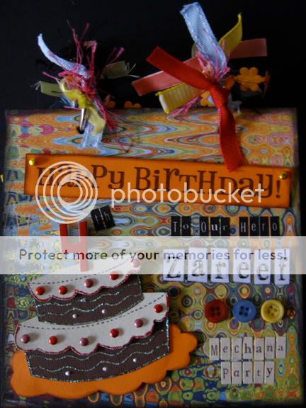

Description:
Feli says:
What a fun album! Love how she placed the embellishments around the photos...
"I want to be a Scientist" by Michelle
Description:
I love Felicia's LO for this challenge! I looked for similar robot and gears stash in my pile and decided to cut out the gears. I used pop dots to "pop" some of the gears. I also used embroidery thread to make 'belts' linking 2 gears. I had lots of fun cracking this challenge !
My jaw dropped when seeing this layout!! I must try this some day. I love how she cut out all the gears, that's so much work but so worth the effort! And the embroidery thread idea is so cool.
Description:
For this LO, I used mostly Cosmo Cricket Boyfriend range. I tried to keep to the cosmic look by using various mists and also stickles.
Feli says:
Supplies: Crate paper static, and chipboards; ranger ink, cardstock, buttons,prima crystals American craft letters.
Feli says:
Sunday, October 11, 2009
Deadline extended!
I've also updated the previous post with the photo of the RAK! And thanks to those who have left a comment!
Tuesday, October 6, 2009
NEW HappyScraps blog!!

I've just created a NEW blog for HappyScraps!! :) And I love this colourful logo adib designed for me!
To celebrate having a new blog and our 1 year anniversary last month, I would like to give away a RAK to 1 lucky supporter of our challenges! =)
To win the RAK, add yourself as a follower and leave a comment to tell us which is your favourite type of challenge (Words / Stash / Graphic / Technique) and why.

Looking forward to hear from you and all the best!! The winner will be picked this Sunday!
Friday, October 2, 2009
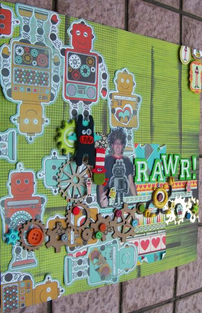
RAWR!
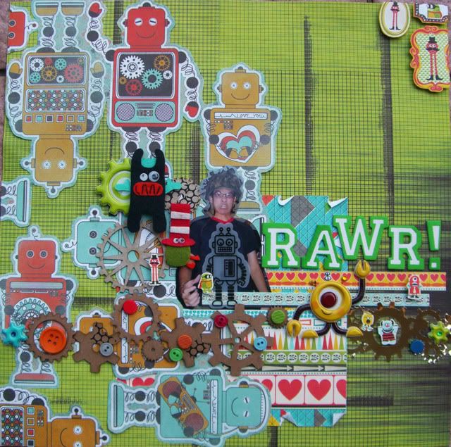
They are so fun to use! And i love the bright colours they are in.. I combined my robots stash and monsters stash together on my layout.
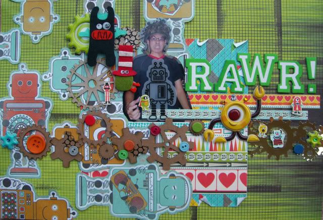
Love those gears, I left them raw but added colours by applying rub-ons, brads and buttons.
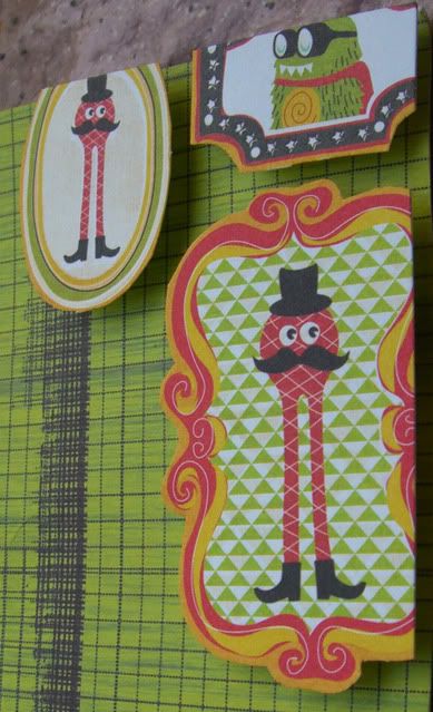
Also added cut-outs of this monsters on my page...
Bought this gold gear tape just before I started this layout! I just knew it'll go well together with all of my other stash. Oh yes, can you spot the tiny monsters i cut out? :)
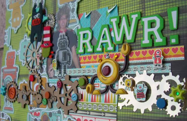
Gonna submit this to Ed's Sunday Challenge @ Laine's because I used 9 things on my layout. Photo, PPs, Chipboards, Brads, Buttons, Stickers, sheer, tape, rub-ons. Woohoo! :)
Thursday, October 1, 2009
Stash Inspired Challenge 4 - All about Boys!

To find out more about how the Stash Inspired challenge works, check it out here...
Email me at feliscraps_challenge [at] hotmail.com with a maximum of 3 photos of your layout / project with a description of it by 30th October, 12 noon. Voting starts right after all the layouts / projects are posted on the blog!
I hope this challenges you to come up with something creative! So let your creative juices flow, DO IT DIFFERENT and just have fun! :) I can't wait to see what you come up with...
Do check back tmr to see my take on the challenge! Will leave you to think about the challenge!
Wednesday, September 30, 2009
Entries for Words Inspired Challenge 4
The position of the words inspired me to layout my pps in a overlapping manner.
Feli says:
The layout has an interesting composition! love how she layout the PPs and embellies.

Inspired by the composition of the words in the image and re-created it on my layout.
Feli says:
What a cute page! Love how she added all the words stash below the photo.

